For Expert Mathematicians only [Sarcasm]
Greater than 100% Vaccine Effectiveness to achieve Transcendental π variant.
I joked the other day that if you find yourself at a store offering a 150% discount and it had no fine print (like “up to”) what would you think?


Clearly the Covid Vaccines are giving those who are over 70 in the UK over 160% protection since boosters rolled out in week 39. (-40% to 120% = 160%)
What’s the physical interpretation of this?

Underlying data:


My questions for experts
How can vaccine effectiveness be over 100% without assuming negative quantities in population or infection estimates. (proof1)
How can denominators “cancel” over time if the denominators are changing over time (Unvaccinated people are getting vaccinated)2
How can boosters have multi-generational effect in those not boosted?3
Do boosters in the over 60 population accelerate “de-boosting” (susceptibility) of 18-29?
Why is boosting anti-correlated with vaccine effectiveness along the 40-49 pivotal age group.
Is this due to 18-40 age group behaving differently due to mega-boosting of seniors.
Or is that multigenerational contact is leading to enhanced susceptibility of unboosted?
Or worse, is it the boosted itself getting sick since boosting has just started in this age group, why not 40-49 then since they are boosting too?
But that’s a tiny group many such an impact?
This cannot be a denominator effect since denominators don’t change against the vaccinated’s efficacy in time varying datasets, it always change against the unvaccinated since vaccinated cannot unvaccinate but unvaccinated can vaccinate. See 2.1 in Footnote.
Update: The brilliant author of Vaccination Nation pointed out that this isn’t impossible if the graph was measuring waning relative to vaccinated itself rather than absolute waning relative to unvaccinated population.
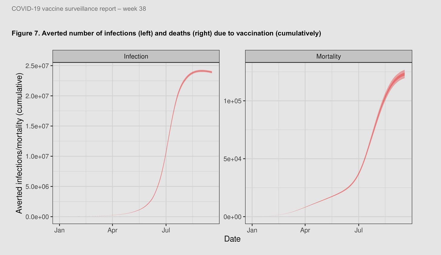
Well, I thought this graph might help explain why I am afraid it’s waning relative to unvaccinated because if it wasn’t, there is no reason for UKHSA weekly vaccine surveillance report to suddenly pull it at the end of Week 38.
Page 29-
And what does negative vaccine effectiveness imply according to their models?
The dip in the “cumulative” graph implies Infection PROMOTION or Epidemic SPREAD. However, they were happy to promote infection only as long as it didn’t show up as promoting mortality.
That was the last time we saw that graph. You can understand why. Boosters started right then.
Vaccine Effectiveness is 100 times the ratio of the proportions of those infected, within all injected and all unininjected
Relative Risk Reduction expressed as percentage
100 x Relative Risk Reduction
100 x (1-Relative Risk)
100 x (1 - (Relative Risk in Vaccinated)/(Relative Risk in Unvaccinated))
100 x (1 - (Infected people are positive/Non infected people are real)/(infected vaccinated are positive/Not infected vaccinated are real)
100 x (1 - (+/+)/(+/+))
100 x (1-(something +)
100 x (something less than equal to 1)
If we assume that the each of (a/b)/(c/d) are positive then we must get a number that’s positive or 0. This would mean the
If we assume 3 or 1 of the figures in (a/b)/(c/d) are negative we can get 1-(-something) which is greater than 1.
Since NIMS dataset cannot contain negative numbers as they explicitly explain being the reason they don’t use ONS dataset, this cannot be true.
See UK vaccination by date data and Infections report showing hundreds of newly vaccinated people making the denominator of the unvaccinated drastically smaller. As a proportion of those leaving the unvaccinated to vaccinated are not negligible fraction of the denominator, but those being added to vaccinated are negligible.
Example: In a population of 100.
25 unvaccinated sick and 25 unvaccinated healthy
25 vaccinated sick and 25 vaccinated healthy
If 5 of those currently unvaccinated and healthy vaccinate then one of these things can happen to the 25/25 vs 25/25
Case where vaccination did not increase morbidity but differentially reduced and increased denominators - 25/20 vs 25/30
VE = 100(1-(5/6)/(5/4)) = 33% Protection!
Case where vaccination increases morbidity and differentially reduced and increased denominators - 25/20 vs 30/25
VE = 100(1-(6/5)/(5/4)) = 4% Protection! with overall Morbidity increase→ 10%
Case where vaccination increases mortality in vaccinated healthy reducing denominator - 25/20 vs 25/25
VE = 100(1-(5/5)/(5/4)) = 20% Protection!
In each case, we get protection whether we kill the newly vaccinated, disease the newly vaccinated or do nothing to their health.
The only impact it has is either increasing disease, reducing population size through advancing mortality, or making vaccination appear protective due to base rate change.
In each case, remaining unvaccinated seems worse than vaccinating regardless of whatever happened. Why? Reminds me of https://mathworld.wolfram.com/MontyHallProblem.html
Note this multigenerational boost effect isn’t new. It’s been seen in Israel too and noted by the Gompertz expert and Nobel Prize Winning Biophysicist Prof. Levitt.


The answer is that the over 100% effectiveness is carried over to the after life where they can request the difference be credited at rebirth.
As usual, the health authorities posted an incredibly misleading graph. The y-axis is ΔVE, but we are never actually given the "true" VE. What can actually be learned from their graph? Absolutely nothing. If VE changed by 120% for those 80+, but started at 10%, then it would only be 12%. If VE dropped by 50% in the 18-29 group, and started at 60%, it would now be 30%. The difference in magnitude is stark even though 120% is much more impressive than -50%. The 120% change may be nothing more than a statistical blip (given something like 90-95% of 80+ COVID cases are in the vaccinated, this seems likely!), and the -50% may represent a disturbing trend.
How to lie with statistics 101.